Hello! This is a guide on shadows, shading, depth, and noise. This guide will show you examples of correct and incorrect usages of the shadows, depth, etc. I tried to use the least text that I could to save you from lots of reading, and visual help is usually much more helpful.
Note: X means "incorrect", and the checkmark means "correct".
Part 1: Shadows
- plugintutorial1.png (4.08 KiB) Viewed 20837 times
- plugintutorial2.png (3.24 KiB) Viewed 20837 times
Part 2: Shading
- plugintutorial3.png (2.31 KiB) Viewed 20837 times
- plugintutorial4.png (3.34 KiB) Viewed 20837 times
Part 3: Depth
- plugintutorial5.png (2.89 KiB) Viewed 20837 times
- plugintutorial6.png (2.07 KiB) Viewed 20837 times
Part 4: Noise
- plugintutorial7.png (3.5 KiB) Viewed 20837 times
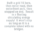
Part 5: Extra stuff
So, after the visuals I've shown to you with a little bit of text, let's compare a building that uses little to no shadows, shading, etc., to a building that uses the said stuff!
- plugintutorial8.png (5.58 KiB) Viewed 20837 times
The blue building is just much nicer to look at, doesn't look as ugly and effortless, and has more detail than the turquoise building.
I hope you've learned or remembered something from this tutorial/guide, have a nice day!
PS: If you've found a mistake or know another trick that can help, feel free to post it here! I'll make sure to update this post. Cya!