in this thread you can see how this rock needle was made.
http://www.theotown.com/forum/viewtopic ... 7276#17276
Note:
- Most of the pictures were enlarged three times (300% size).
- My english is not so good, so I often used the Google Translator.
- I used a Wacom graphic tablet and PaintShopPro-9 to create this rock.
- The rock needle has no concrete template...it is a product of my mind.
Step 1.
First we start with the ground and a simple border.

Step 2.
The rock area is filled and some simple lights and shadows are added.
It is very helpfull, if your graphics tool has some layer support.

Step 3.
Now we use Google to search for some rocks and mountain pictures to have an idea of what colors are realistic.
Then we use these for our image.

Step 4.
Some more ligh and shadow.

Step 5.
In this step the Wacom graphic tablet was used first to draw the the side of the rock.
No need to have some special brush or pencil options (like pressure or opacity....). I just used the pen from the tablet as a replacement for the mouse.

Step 6.
The target is to add more and more details to the rock...


Step 7.
To have a more "pixel like" look, the colors of the rock have been reduced to a color palette of 224 colors. After that step the amount of colors must be increased back to 32bit.
Copy the rock layer into a new picture, decrease the amount of colors, copy the rock back into the original picture.

Step 8.
The rocks are mostly black, grey an white. But that does not look good.
So you can use a color balance function to get slightly warmer colors.
Now we have more brown and orange colors.

Step 9.
Adding some noise to the image we get a more detailed look for the rock.

Step 10.
Once again we decrease the amount of colors to 224.

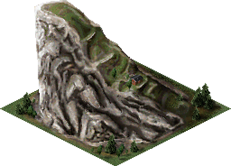
Step 11.
Add some decoration like trees and perhaps a small house.
Remember to use a new layer for that.
Then add another layer for the shadows, for the trees and other deco objects. Use a black brush with an opacity value of 25% and a hardness value of 20-30 to draw some shadows.
As a last step the image is made a little bit sharper while using the sharpen- or unsharp mask funktion.
In PaintShopPro-9 the shapen funktion is much too strong, so i used the unsharp mask 3 to 4 times. The image gets much more contrast.

And this is the final result of the work
Not perfect, but I like it